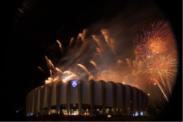
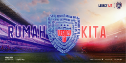
Sultan Ibrahim Stadium Launching
This was the grand launch for 2020 of the Legacy Lit, which became history in the making for this outstanding home for JDT FC. Bright lights, rocking entertainment and good vibes was the order of the night for all.
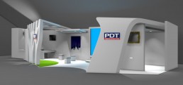
PDT Exhibition Booth
The client sought a unique booth in order to stand out above the clutter during the Expo Johor Berkemajuan. To that end, Lakoo came out with an organic design that symbolized growth and progress, whilst maintaining an air of purity with the overall white appearance. The design also facilitated better traffic flow whilst ensuring pertinent areas achieved maximum visibility.
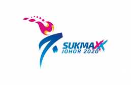
SUKMA XX Johor 2020
This Logo & Branding campaign for the 20th Sukan Malaysia (SUKMA) in Johor 2020 encompassed conceptualization to the final output of a brand image that was daring, bold and celebrated the spirit of competition and excellence above all.
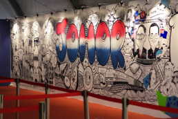
Ekspo Johor Berkemajuan - Mural & Projection Mapping Showcase
This rebranding exercise for the Johor GLC was geared towards enhancing the public’s trust and support for the stakeholders and investors. The result of this exercise was an image that is bold, memorable, reliable and prominent across all mediums.
JDT FC Gala Night
An appreciation night for sponsors and partners, the JDT Gala Night was indeed a night not to be missed by all as the entire ballroom was beautifully bedecked with all manner of decorations befitting the theme ‘Black & Goal’. From 5-star entertainment to world-class cuisine, no expense was spared for this memorable occasion.

IRDA
Taking a contemporary cue, the design approach made use of the Habbo/Minecraft treatment which created a casual, relaxed and approachable image for the developer. This concept enabled them to be more appealing to the masses and allowed them to share their initiatives and community development efforts with all and sundry. Striking colours were used to further add impact to the friendly and fun-oriented visual communication.
The Lit Launch JDT FC Jersey 2020
"Make way for the King” was the order of the day in this auspicious launch event where JDT FC introduced their new jersey for 2020.

Exco Awayday 2017
This branding via event exercise took the form of a brilliant programme by the state to monitor the state’s performance and the Key Performance Indices (KPI) of the Executive Committee. The resulting image presented the state in a positive and progressive light via various elements such as mastheads, logos etc.
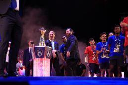
J6 Neon Celebration MSL Champions
JDT Football Club celebrated its 6th consecutive championship in MSL 201 in unique J6 style with a night of glittering revelry that was witnessed by its millions of fans across the globe.
SIS Launching Campaign
This was a clear declaration of Champions – a resounding statement that brought fans into a familial state of mind. It became a pledge that only true, die-hard fans will understand, keep in their hearts and uphold to the end.
Firefly
Firefly sought to project a fun & friendly approach to their new image style. To that end, a particularly quirky and appealing digital illustration imagery was proposed whereby the airlines was portrayed as carefree, cheerful and warm through their new promotional campaign. Light, pastel colours complemented the vibrant and positive images used with a lighthearted feel to the overall visual tone and manner.

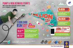
Bank Simpanan Nasional
Long regarded as a rather conventional bank, BSN wanted to make an impactful makeover and this was achieved with a hip, fresh, new look that totally captured the attention of Malaysia’s new generation of youngsters and young adults. This is what happens when creativity is given free rein to deliver above and beyond the ordinary.
TMR UrushartaRe-branding
Focusing on the many aspects of realty management resulted in this logo design and ensuing Corporate Identity guide built around the various green tones that represent the diversity and scope of responsibilities involved. The optical-illusion square also represents the building blocks that form a valuable piece of property.
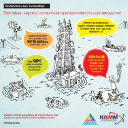
MCMC – Flood awareness campaign
MCMC wanted to create a Public Service Announcement, but unlike previous efforts by other organisations, it sought to create a more engaging, appealing image – thus resulting in the work here which was ultimately more casual and fun, whilst still being able to convey a very serious message. The cartoon-like treatment was eye-catching, whilst key alert colours like yellow and red helped drive the message home.
MCMC – Check Your Label (CYL) - Lowyat
This outdoor and ambient campaign at Low Yat plaza was executed in conjunction with the CYL awareness month and made use of a rather alarming image to catch the public’s attention and drive the key message home. The stark contrast of colours served to further enhance the campaign’s impact on passers-by.